A quick look back at how our NIPI signaled US CPI turning points in the last 18 months
To forecast near-term inflation is no easy task, as illustrated by the April-2021 US CPI which came significantly above expectations, a remarkable miss because the release had been very much a focus point.
One reason why forecasting near-term inflation is hard is that good models are not enough. Even the best Machine Learning model using sophisticated web scraping data is not.
A compilation of micro shocks
Experienced inflation forecasters will tell you that what often makes most of the unexpected volatility in inflation releases, at a 1 to 3 months horizon, is micro news: events that do not fit in time series because they cannot be easily measured or are not regularly tracked. Often, they are once in a decade micro events, or once in a lifetime even.
Turns out, there are lots of those once in a lifetime events at the moment.
Tracking unstructured data
We have built indicators to track this type of news. We focus on those unstructured data (text) which are hard to track. Those indicators do not make a forecast by themselves, but they should augment time-series based forecasts, which rely on structured data (whether traditional or alternative).
One of those indicators is the News Inflation Pressure Index: a balance of positive and negative inflation news, with a breakdown by country and/or sectors. A value of 50 means an equal volume of positive and negative news, a value significantly above 50 implies a positive shock.
Comparing NIPI and CPI
Let's take a look at what our US NIPI had to say, on both US headline and core inflation.
A few quick methodological points need to be made beforehand, for those interested in the technical details (others can jump to the next section):
- the CPI is released monthly with a 2 weeks lag, while the NIPI is available daily, so in order to compare the two we show the CPI as of release date;
- we compare the NIPI with volatile month-on-month rates which is really demanding on the NIPI;
- the NIPI on the chart summarises info in the prior 30 days, so even if it was contemporaneous with CPI on the chart it would still mean that the underlying data we track can lead by several weeks;
- the short NIPI history at this point (3.5 years) and the monthly frequency of the CPI do not give us enough points to make a more statistical assessment, but looking at charts can give an idea;
- remember the NIPI is not a forecast by itself... but we can show that it does contain a lot of information
Headline CPI
The below chart shows the US Headline NIPI (the continuous line) and headline CPI m-o-m rates (the dots):
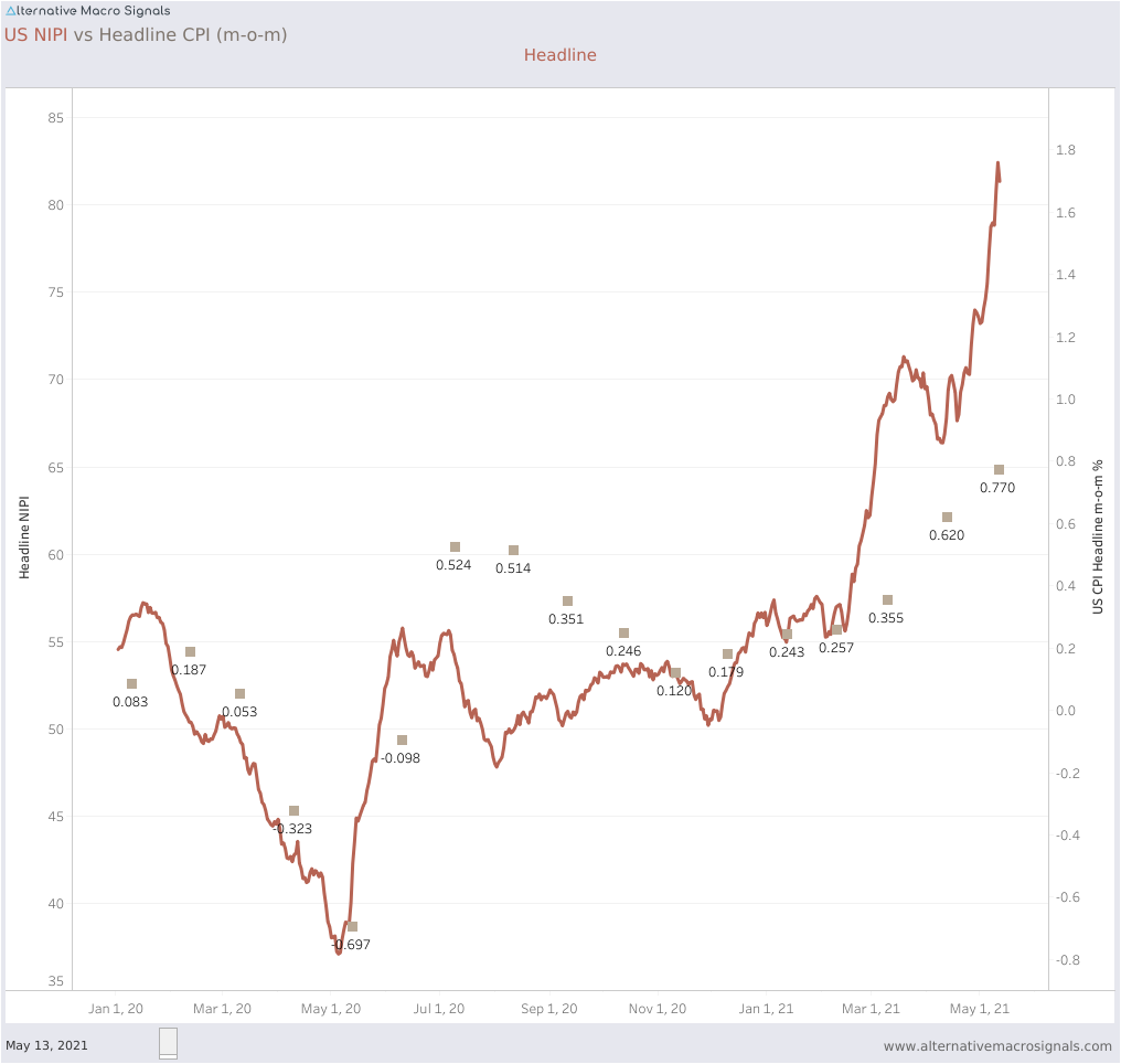
NIPI vs Headline Inflation, US
Headline NIPI roughly shows a lead of several weeks when we look at the main turning points, for instance:
- the slow down in the March and April 2020 CPI releases (released respectively mid April and mid May) which were signaled by a drop in the NIPI below 50 at the end of February;
- the inflation rebound in May and June 2020 CPI prints which started being signaled by the NIPI from the end of May;
- the stabilistion in trend inflation in the last part of 2020 after the summer rebound;
- the sharp acceleration in the March and April 2021 releases (released mid April and mid May), which had been signaled by the headline NIPI starting in the last week of February, to historical all-time highs.
Core
Core inflation can be harder to predict as we take out the more volatile components from the inflation basket (energy at least is easier to track than most core CPI components).
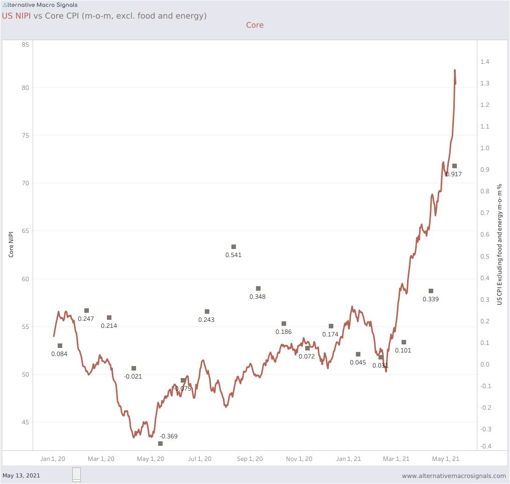
NIPI vs Core Inflation, US
The observations made for headline inflation broadly hold for core. The turning points around the summer 2020 were correctly anticipated and the most recent spectacular acceleration in core inflation was equally well captured. The core NIPI is still near historical highs at this point in time.
True, core NIPI underestimated the core acceleration in the summer 2020. But the NIPI was in effect suggesting those levels would not be sustained, which proved correct, so the trend at least was right.
These examples hopefully illustrate what can be done with unstructured data. There are many other ways to slice the data to show different patterns, including even more timely measures considering the 30 days smoothing window used here.
Don't hesitate to reach out for more details.
